We are Hudson Willow

During a busy past year, and as a young and growing agency, planning a time when we could create our visual and voice identities proved challenging. But, good things come to those who wait.
Journeys
We began working on our brand identity over a year ago and arrived on the concept of pathways; long and limitless wavy, geometric and straight lines born from the Hudson Willow logo that represented our partnerships with clients and our long-term view.
In the spirit of bringing the best of the past forward, we evolved the pathways into journeys.
Colour palette
Since the conception of pathways, we had developed as an agency and a team. But the concept still very much resonated. In the spirit of bringing the best of the past forward, we evolved the pathways into journeys. This felt like a strong visual reflection of our belief that every brand building process is a journey.
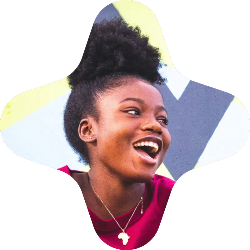
For our journeys we created a vibrant, bold colour palette. The colours looked incredible but didn’t feel right in application. It was loud. Hudson Willow is quietly confident, not loud. We were at a crossroads; do we plough on with what felt like a case of mistaken identity, or do we revisit our thinking?
Voice
Of course, we revisited our thinking. Our own brand has since become a great example for why voice should always take the lead. We’d mapped out a new framework for Hudson Willow’s voice identity all the way from brand persona to language and style. The voice that spoke to us didn’t align with the tonality of the loud colour palette or treatment of the journeys. It had weight, depth, wit and real creative intelligence. This was where the colour palette needed to go.

A true reflection of our creativity, sharp thinking and experience.
Visuals
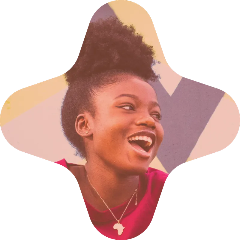
The colour palette you see across our website and communication includes warmer, but still striking, tones. The eccentric mix of colours has real depth and no less playfully bring our journeys to life while reflecting our brand personality.
Our paper-coloured background evokes substance and sincerity, providing a considered backdrop for the journeys and a canvas for creativity. The bright green strike helps our host of archetypical characters cut through culture; they are timeless personas, subjects and stories that connect our work to the world.

Authenticity
We’re delighted to have created a brand that prioritises authenticity. By digging deep, reflecting and revisiting we developed an aligned voice and visual identity that we’re proud to represent us. It is Hudson Willow, a true reflection of our creativity, sharp thinking and experience. Call it irony, call it validation, but it’s been a journey.


Authentic brands are successful brands.
Authentic brands are successful brands.
Authentic brands are successful brands.
Authentic brands are successful brands.
Authentic brands are successful brands.
Authentic brands are successful brands.
Authentic brands are successful brands.
Authentic brands are successful brands.
Authentic brands are successful brands.
Authentic brands are successful brands.
Authentic brands are successful brands.
Authentic brands are successful brands.
Authentic brands are successful brands.
Authentic brands are successful brands.
Authentic brands are successful brands.
Authentic brands are successful brands.
Authentic brands are successful brands.
Authentic brands are successful brands.
Authentic brands are successful brands.
Authentic brands are successful brands.
Authentic brands are successful brands.
Authentic brands are successful brands.
Authentic brands are successful brands.
Authentic brands are successful brands.
Authentic brands are successful brands.
Authentic brands are successful brands.
Authentic brands are successful brands.
Authentic brands are successful brands.
Authentic brands are successful brands.
Authentic brands are successful brands.
Authentic brands are successful brands.